For many people, a country house is something like a cherished dream - the prospect of taking a break from the bustle of the city in a cozy corner seems quite rosy. Moreover, you want not only to purchase a ready-made building with a landscaped garden plot, but to create the estate of your dreams, in which all your wishes regarding design and layout will be correctly embodied. There is only one thing left to do - transfer your ideas to paper, and only then, having drawn up a house project and determined its location on the site, bring it to life (engage in the actual construction of the house). If regarding the second point, by definition, there can be no doubt about the need for third-party help - even if you are a professional builder, you will not be able to build the right mansion yourself, but the costs of hiring an architect can be eliminated. How can design and construction be made cheaper? Yes, it’s very simple - it’s quite possible to do the work yourself, even without any special skills in creating a private house project. Designing a house (drawing it on paper schematically) is actually not that difficult!
What should you consider when designing your own home yourself?
The most important thing is that the house construction project you develop is created based on the following principles:
- Multiple functionality - that is, the house built according to this project will be convenient and practical in all respects. A do-it-yourself house design should be no worse than an architect’s;
- Simplicity of design - it will not be difficult to design a house only if it does not involve any frills. The creation of some particularly complex project, the implementation of which will require a huge amount of creative delights, is highly discouraged for a person who does not have a special education, because some fundamentally important things may not be taken into account;
- Aesthetics - of course, a country house should look beautiful and please the eyes of its owners. The design of a reliable house should also be spectacular!
Remember - if the project is created taking into account these principles, then it will be very good in life. Again, we are talking about a rather primitive independent structure - an amateur would not design a premium-class cottage. Only an architect should be involved in designing houses of this level - beginners here very often make mistakes.
Geological exploration of the house site
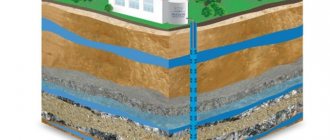
Where does “do-it-yourself home project work” begin? First of all, when working on a house project yourself, it is necessary to conduct a geological exploration of the site - assess the nature of the terrain, soil and find out the groundwater level. The best time of year for this is spring, then their level is as high as possible and it is possible to determine this indicator with maximum reliability. It is very important to do this based on the fact that this indicator is of greatest importance when laying the foundation of a private house.
To determine the depth of groundwater, we recommend contacting a specialist
Think over your link building strategy
Think about where you can advertise yourself, and how exactly you will build up your link mass on third-party sites. Internal links are important and necessary, but you can’t do without third-party links. You need to both link to third-party sites yourself (with good ratings and TICs), and receive citations from such portals. Think about how to achieve this in your case.
- Guest posting: how to publish, insert links and not pay for it
- What site checks should be done monthly: prevention and error diagnosis
- Top 64 Google Ranking Factors Relevant in 2021
Start designing a house
For a clear example, our editors used the free demo version of the Visicon program. But all the steps can be performed on a regular sheet of paper. For example, a simple project of a two-story house 10 m x 10 m was chosen
To design houses, you will need to “arm yourself” with an ordinary checkered notebook sheet and a pencil, while setting the appropriate scale. The most rational thing to do in this situation would be to do the following: ten meters of land should be designated by two squares. Thus, one centimeter on a ruler will equal 1 meter in real life - the ratio is one to one hundred.
Step 1: draw the outline of the house on a notebook sheet using a ruler and pencil on a scale of 1:100, i.e. 1 cm on paper is equal to 1 meter
Drawing on paper the outline of the site itself, as well as future buildings. In this case, all work must be carried out in strict accordance with the correct scale - by carefully measuring every meter on the ground and putting it on paper in accordance with dimensions one to a thousand, you ensure the reliability and aesthetics of the building being constructed. You can draw a project this way very quickly. It is imperative to take into account not only the contours of the site allocated for design and construction, but also all the objects located on the site that were there even before its planned construction, and at the same time there is no possibility of moving them. After this, it will be possible to begin designing the building itself - to simplify the task, we will assume that the designed house will consist of four rooms, a kitchen and two bathrooms (standard housing for a family of several people).
Site design
The first thing a user will see on the portal is its appearance. We need to keep up with the times and implement the features of 2021. It is not necessary to try to match everything at once, otherwise in a year you will have to redo everything again. Take only what matches your corporate style and will look equally good now and in a few years.
Three-dimensionality
It seems that this trend has developed a stable “swing”: volume returns once every 2-3 years, after which it disappears in favor of 2D and returns again. In 2021, the trend will be realistic 3D elements (the main thing is that they do not have the “uncanny valley” effect).
Volume
MacOS Big Sur users have already checked out the “3-D icons”. This trend is gradually entering web design, so you should expect volumetricity and even implement it yourself.
Layers, floating elements
If Forrest Gump says that “life is a box of chocolates,” then we say that websites in 2021 are a real layer cake. Over the past few years, users have become fed up with the fashion for scrolling effects. The modern user wants to see maximum ease.
The easiest way to achieve this is through working with layers. Then you can create the illusion that some of the content is literally floating in the “air”. This is exactly what a user who is tired of life’s ups and downs needs.
An excellent example of such “lightness” is the website of the design studio LEVELLEN. Working with empty space gave it the airiness it needed.
When you look at a car advertisement, your eye doesn't pick out individual details. A ray of light reflecting from a mirror-clean sedan does not “sell” the car to you, but it helps you immerse yourself in the atmosphere of the photo and imagine yourself driving this car. Photos like these rarely have clever graphics, captions, or “Super cozy and comfortable sedan” cues, but they still work. I also appreciate the attention to detail on the site. The important thing here is not how much graphics you use, but whether it helps the user imagine themselves owning the product. Spoiler: most likely not.
A good design, like a painting or that shot from a car advertisement, has the task of focusing attention on the main thing. If additional elements appear in the design that do not convey information, they will prevent you from concentrating on the product.
What parts can be used?
Firstly, this is really important (!) information: product characteristics, conditions for its purchase. The text must be clearly structured; it requires working with text styles, accent fonts, and sizes. Photographic materials are acceptable. Graphic elements should emphasize the properties of the product or complement textual information.
Therefore, try to write content short and clear, and use graphics only where you really cannot do without them. In the end, structure and information are the key to design detail, not the amount of graphics or text you might create.
Mix of graphics and photos
The trend for combining graphic elements with photographs began somewhere in the middle of 2021 and has no sign of slowing down yet. Take it into use: this is a simple and quick way to breathe “life” into the graphic component of the site and link photos into one composition.
This rule is perfectly illustrated by the LISTME company website. Thanks to the unusual animation, you can immediately see how individually selected landscaping will enliven even a drab office.
This technique is also used by the LEXXIS language school. Thanks to this, the site looks more “alive” and modern.
In our work, we often mix photos and graphics to diversify the visuals. You can simply put a square photo, and you will end up with a boring, static composition. Or you can round this photo, put a shadow, creating the effect of flight, geometric shapes - this will add dynamics. And now, from a boring template solution, we get a unique job.
This was the case in the lexxis project. We are faced with the fact that the topic is quite voluminous in terms of the amount of content. It cannot be removed or shortened. All that remains is to diversify and add air, for which we took the signature red-burgundy color, which would partially unload the page, slightly drawing attention to itself. We enclosed it in the shape of a circle with an outline and played with it in various ways in the design. We added light animation to them, and now a seemingly strict, laconic site with typography and serifs becomes easy to understand for different age groups.
Vector graphics
You need to adapt to the mobile user. But how to do this if one sits on a 3.5-inch sneaker, the second has an iPhone 11 Pro Max, and the third changes Android phones like gloves? Only through vector graphics! It is not tied to pixels, it is easily scaled and adapts to any diagonal, from smart watches to 4K TV.
This is exactly what we did when creating the Imeretinskaya Lavka delivery website. The main elements are made in vector, so they are easily scaled for viewing on any device.
More numbers, data and research
During 2020, the average user has seen so much Fake News that they are now blowing cold air. If you want to cultivate love for your business from the very beginning, share numbers, teach them interesting things. Think about how to present all this analytics correctly.
For example, the all-Russian customs representative TAISU-TB provided quality certificates and a list of satisfied customers directly on the title page of the site.
Dark colors
With the introduction of dark themes in 2021, this design feature shows no sign of slowing down. A dark background looks elegant and does not “burn out the eye” like dark text on a snow-white background. Moreover, such themes help save energy and increase the lifespan of OLED screens.
This is exactly how we made the website for the video studio “Videozayats.RF”. It skillfully combines a dark theme, vector graphics and working with layers.
When choosing colors for the interface, take into account not only trends, but also the brand, service and product itself. The dark “theme” is not for everyone, but no one forbids “playing” with shades of gray 
For almost a year now, designers have been actively using dark themes in their work. Alas, it will not be possible to scale their experience to everyone: there are topics that simply do not provide for this. In RuNet, dark colors are usually associated with the luxury segment or gaming - here it will be as organic and harmonious as possible.
As part of the VideoHare project, we decided to deviate a little from the unspoken rules and develop a design for a specific request - to differentiate ourselves from competitors and show the premium nature of the product. With the help of the chosen colors, we emphasized that the company operates in the market of motion animation and other complex mechanics.
First floor project
We draw the vestibule and the hallway on the sketch - and from there there will be transitions to the kitchen and other rooms. The location of the premises must take into account the following points:
- The bathroom and kitchen should be placed in close proximity to each other - thanks to this location it will be much easier to carry out communications;
- It’s very good if the drawn up project implies the absence of passage rooms - this is an integral element of comfort;
- On the ground floor, it is necessary to take into account the presence of all auxiliary structures and premises - their location will be very important not only to ensure the functional suitability of the house, but also for the comfortable movement of residents.
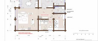
Step 2: draw all the rooms and premises of the first floor with the required size
After this, we arrange and plan all the doors of our house
Step 3: designing doors on the first floor
Then windows, taking into account the desired lighting of the rooms and your budget
Step 4: designing windows on the first floor
As a result, we get this first floor:
This is how the 3D model of the first floor turned out
Minimizing words with high Keyword Difficulties
Keyword Difficulty is an index that shows how difficult it will be to overtake your competitors in the Google search engine. In total, assessments are grouped into 3 large blocks:
- 80% is Jedi level. If you take search words with such complexity, get ready for an infusion of huge sums (depending on the field of activity). Newcomers without a suitcase of money are better off not coming here.
- 60–80% – Quentin Tarantino in the world of keywords. Yes, you won’t have to use superpowers to be in the first search results here, but you’ll have to compete a lot.
- 60% - on easy. Such keys have regular traffic and are ranked well, but there is no fierce competition. An ideal choice for newbies.
Drawing the second floor
Here everything will be much easier - after all, the rooms in the house can be located identically (the most important thing is not to change the relative position of the bathrooms - in order not to complicate communications). It will be enough to design the location of the front door (many architects recommend making two entrances to the second floor - at home and from the street) and windows.
Step 5: We plan the premises of the second floor in the same way. Don’t forget about communications - we place the bathrooms and bathrooms one below the other
Step 6: Place the Doors
Step 7: draw the second floor windows
We received this 3D model of the second floor
Working with locality
Now we are almost at the finish line. All that remains is to show the search engine which region the site operates in. This is done as follows:
- Pages in Google Business and Yandex are optimized. Directory";
- Regions are configured correctly in Yandex. Webmaster" and Google Search Console;
- properly designed micro markup in the “Contacts” section;
- yours, Google and Apple Maps;
- there are no affiliates (or they have a different address and phone number in their contacts);
- the site was added to thematic directories: search engines still index such sites. The more portals talk about you, the better.
Subdomains: how to effectively promote a website with a specific geo
Attic and roof design
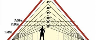
We decided to create a house project ourselves - there would be no need to try to draw some kind of too “abstruse” roof with a lot of bends. Remember - the roof is one of the most important structural components in the house, and trying to create additional aesthetics by questioning its reliability is certainly not worth it. All this will lead to leaks occurring at the bends. If you are drawing a project, please adhere to the principles of minimalism in architecture.
To design such a roof, you cannot do without an architect.
Dependency of designing a house with insulation
There is one very important rule - all auxiliary premises must be built on the north side. Despite the fact that thermal insulation performed using building materials is of paramount importance, the relative position of the rooms should also not be overlooked - if only because of the savings in energy consumption for heating the house.
Preparatory work
Preparation is the most important part of development. Even experienced specialists will not create a Dream Website until they have drawn up a clear technical specification, which is only possible after all the preparatory work has been carried out in full.
Niche and competitor analysis
You must understand who you will have to compete with for the user’s attention and wallet. Conduct competitive intelligence in your niche. Pay attention to how competitors’ websites are structured, their USP, quality and manner of running social networks.
Articles that will help you conduct a competent analysis and avoid making mistakes:
- Review of services for obtaining competitor website statistics: who shamelessly lies and who shows the truth
- 5 reasons why you can’t copy a competitor’s website, and what to do if you really want to
- Interview with Dmitry Kot: how to explode sales by setting yourself apart from competitors
- 24 services for analyzing competitor sites
- 6 services for tracking competitors’ advertising that will help you save your advertising budget
SWOT analysis of business
Determine the company's strengths and weaknesses, opportunities and threats on its horizon. Understand what the USP that you will promote via the Internet will look like in the eyes of the consumer and competitor.
For example, friendly store assistants are an offline USP that will encourage customers to use your services offline. What will be your USP for those who use your services on the Internet? Decide for yourself by analyzing your competitors. This could be instant door-to-door delivery, providing dozens of testers/samples at the first click, etc.
Market analysis before launching a business: minimizing errors at the start
Approval of the project to begin construction
The need to adjust the project. Even if you yourself were able to depict the house of your dreams on paper, you will still need to consult with specialists before starting construction of the house - the opinion of a competent foreman or architect will not be superfluous. At a minimum, the following points will need to be agreed upon:
- Carrying out electrical work;
- Conducting your own sewerage system;
- Carrying out water supply;
It is necessary to understand that all the above issues are not an artistic or architectural part of the project. These are all the most routine issues, a competent approach to solving which is provided only by professionals in their field. As a last resort, any oversight in independently drawing up a house project, which was made by a person who does not have a specialized education, can be corrected by a competent foreman who understands the practical side of any idea much better. Although even if the project is drawn up by professional architects, purely practical shortcomings cannot be ruled out.
Independent work on a house project and its advantages
You can create the design of your house yourself - in order to develop drawings of the relative position of certain rooms, as well as determine the place of the house on the site, you do not need special knowledge. A competent and responsible approach to business will ensure the success of your event. However, in terms of communications, it will be necessary to consult with professionals. This way you can properly plan a house that will serve you faithfully.
Read about the following stages of construction:
Types of foundations used in construction
Which is better to choose a foundation for the soil and type of house
Water supply for a private home
Watch also the video on how to make a house project yourself
Read about the previous stages of construction:
Layout of land for building a house
Checking for search engine sanctions
After working through the main part of the site, it is worth finding out whether search engines treat it normally, and whether the portal has been put under a filter. To do this, you need to check whether it violates the basic “rules” of fair work.
Search engine filters: a checklist for diagnosing Yandex and Google sanctions
The most common reasons for “filtering”:
- non-unique content;
- viruses on the site;
- external links from low-trust sites, fake news and portals under “filters”;
- re-optimization with keywords;
- unsystematic link building (spamming links);
- boosting behavioral indicators;
- too aggressive advertising;
- affiliates (in the best case, the search engine will select 1 site from the “network” and block all others);
- various gray technologies such as phishing, cloaking, etc.
This is just the tip of the iceberg, which only grows every year. The most current lists can be found at Yandex and Google itself.
Why would it be beneficial for me to design rather than engage in another type of freelancing?
You are free to do whatever you want. Not everyone likes designing. This is a job that requires care and responsibility. This is why design pays well.
The average salary for designers is 45,000 in Moscow. By spending a couple of days drawing projects, you can accumulate a large sum, it all depends on you.
Customers who demand to do a lot and pay little are a meager number when compared with other types of freelancing. There is a work!
Development of project documentation
The preparation of project documentation considers its main goal to identify the technical feasibility of implementing planned activities. During the topographic survey, specialists develop a relief plan of the territory, necessary for the subsequent organization of engineering operations. Based on the design documentation, technical specifications for construction are formed.
Additional check: we consolidate what we have passed
Did you think that was it? Well, no, if you start working on the site, it’s better to double-check the following right before the launch.
- Domain name and basic data (site skeleton, keys, duplicates, meta-data, links, etc.).
- All text, from product cards and blogs to UI texts.
- Mobile version. The site should work on both an old Android smartphone and the latest iPad.
- Connect to social networks and link mass from them to your website.
- The site has a reviews section, under each product/service there are reviews. The site is connected to Google Business / Yandex. Directory”, and you can also leave a review there.
- Ready content for the site.
Good luck in promoting your site!
Usability: putting the user first
It’s worth finishing by checking the “usability” of the site.
- Navigation and the site itself are intuitive.
- The click map is completely ready. Everything that gets in the way has been removed.
- Additional cross-browser check.
- All forms work, letters of gratitude are written and “touch” the target audience.
- All UI texts are correct (“buy”, not “bye”).
- Additional check of links, interlinks, navigation blocks.
- There are no annoying pop-ups and push notifications (like on sites with illegal online cinemas).
- There are links to the main social media, “Share” buttons for all popular social networks.
- Chatbots are loaded with all the basic questions, they understand “human speech”, and are regularly updated. There are teams that switch directly to technical support.
- Tools for diagnosing problems are included. The most popular: PageSpeed Insights, Google Search Console, Google Analytics, developer panel in Chrome (Lighthouse tab), Yandex. Webmaster", "Yandex. Metrica", PR-CY (express site analysis), Ahrefs (backlink analysis), Xenu Link Sleuth (search for broken links), Popsters (social network analytics), MozBar (toolbar for analyzing key SEO parameters on open pages), Similarweb (search and analysis of competitors), UsabilityHub (testing the site by real visitors).
- The main site metrics are normal: LCP, FID and CLS.
- Metrics that track visitors are connected: AOV (average bill), LCV (customer lifetime value), CPA (cost per target action), CAC (customer acquisition cost), ROI / ROMI (campaign return on investment indicators), conversions, bounces, share of advertising costs , analytics metrics for social networks and newsletters, keywords that bring in customers.
