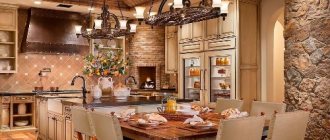
A kitchen apron is not only a protective screen for the work area, but is almost always its most decorative part.
The abundance of modern materials that meet the high requirements for finishing in the kitchen, but at the same time decorative and original, makes it possible to create a unique kitchen apron design.
Gray kitchens: pros and cons of color
“Gray is the second beige.” This is the golden mean between black and white, but the versatility of this color is not always beneficial. Let's see what advantages and disadvantages there are in using gray in kitchen design.
pros
- universal base: ideally combined with bright and pastel shades;
- suitable for almost any style;
- always in fashion.
In skillful hands, it can make almost any kitchen noble and harmonious. It is easy to work with and combines with all shades of the color wheel. That is why designers often use it as a neutral base for creating beautiful interiors in loft, high-tech and art deco styles.
Minuses
There are not many cases when it is better to refuse gray, but it is important to know them.
- Dark gray is not recommended for use in a small kitchen (up to 8 sq.m.).
Light gray, on the contrary, can visually expand a small space.
- Dark gray is undesirable when the kitchen has poor natural light due to small windows or a shady side.
- A monochrome interior can look cold and uncomfortable.
Gray has a huge range of saturation and has many shades - graphite, platinum, marengo, etc.
The right shade and its intensity are the key to success. We’ll talk in more detail below about how to use gray correctly to reveal its best properties.
Features of white and gray colors
Pure white color has an exceptional character: depth and exceptional purity, to a certain extent sterility, order and solemnity. Gray is an ambiguous tone. It has the color of dust, a shade of ash, and notes of graphite, pearl, and stone. It looks completely different with a metallic, gloss or matte finish. Pay attention to the character of gray curtains: matte fabric seems dirty, invisible or neutral, a little shine makes them elegant, inclusions of darker threads make them stylish and luxurious.
The photo shows a glossy white and gray kitchen.
The gray-white combination is characterized by neutrality, conciseness, restraint, and dynamism. It is difficult to clearly describe the interior in these colors. The design can use a duet of shades both in the facades of the set and in the decoration of the entire room.
The white-gray palette can be both warm and cool, so it is almost impossible to recommend it for a certain type of kitchen, because the shades can contain notes of lilac and yellow. The choice of details mainly depends on the gamma of gray: curtains, furniture, trim, decor.
Layout features
Does gray color play a role in choosing a layout?
Designer tips
Irina
Irina Polyakova is the founder of an interior studio, architect and interior designer. The main area of work is kitchen design
Shade can really be important when the size of the kitchen is very modest. For example, if the design concept involves dark gray facades, which are undesirable for a small space, then eliminating the top row of cabinets may be a compromise. Thus, dark shades only in the design of the lower tier of the set will not affect the visual perception of the size of the room.
Another solution is a combination of a gray bottom and a light top for a corner, straight and U-shaped kitchen.
The idea of a two-row kitchen is difficult to implement, as it will require taking into account not only the size of the room, but also its proportions. To prevent the space between two dark rows of cabinets from turning into a narrow portal, decorate the apron in light colors.
Watch a review of a beautiful U-shaped kitchen in the video :
The most frequently asked questions about gray kitchens
1. Gray set + gray walls = too pale combination?
If you play the shades correctly and choose textures, then no!
A good example: combining concrete with materials that have a smooth surface. Brutal interior solutions are trending now. And the texture of concrete cannot be called boring - the material is heterogeneous and with each application it forms various, unique configurations and patterns. Another good thing is that the grayness of concrete can be balanced by using black and white details.
If brutal notes in the interior are not an option for you, but the very possibility of boredom from total gray scares you, use the classic technique: duets of glossy and matte surfaces and materials. For example, the entire set can be made matte, but the inserts can be made glossy. Inserts made of dark solid wood are also appropriate.
Sometimes, to add variety to a monochrome interior, just one bright detail will be enough. For example, such a detail could be a bright red high bar stool. Imagine it on a neutral gray background - it looks very impressive!
And, of course, don't forget about countertops. If you make them white, cabinets with gray fronts will become visually lighter.
Grey/beige: which color is better?
Both shades are classic solutions for creating the most neutral and calm interiors. Plus, they look good together. Therefore, when looking through photos and references of popular designs, you will notice that such a color duet is found in them quite often.
For example, you can make the backsplash and walls beige, and the upper and lower cabinets of the kitchen set in various shades of gray.
And don’t forget that the dining group is also one of the components of the kitchen interior. In this case, you can make the table gray and the chairs in beige wood shades. Or vice versa.
There is another interesting way to combine gray and beige tones in the kitchen. For example, order a set of an ambiguous, complex shade, the perception of which depends on the lighting. The more complex the color, the lower the risk that you will get tired of it soon.
The same technique can be used in the process of painting walls. If you're having trouble deciding on a paint color, add a little gray to the jar. It will add nobility to any color.
To choose the right shades of beige and gray, follow these rules:
- do not create harsh contrasts. For example, if you chose a dark shade of gray, then the beige should be quite dense;
- a combination of light shades of baked milk with gray. The former will make the space warmer, the latter will cool it down. The result will be something in between.
Is it possible to combine gray with wood?
Of course yes. Moreover, this is a classic combination! Wood, just like beige tones, will “insulate” the interior, and gray will “cool” it.
For example, you can make the floor wooden, and gray slats on the ceiling. The result will be a truly Scandinavian interior. The effect will be enhanced if you decorate the backsplash with white tiles.
However, in the absence of any additional accents, perhaps such a design will still look too pale. Therefore, you can decorate the floor with tiles with some active pattern in a gray-blue tone.
Note that wood of a reddish hue has reappeared in trends. If it is combined only with milky and beige tones, there is a risk that the renovation will take on a touch of past years and will not seem modern. To avoid this effect, dilute the design with dense gray textures.
Gray tinted wood is another fresh trend. As a rule, plywood is tinted. And they do it in just one layer. That is, in some places the natural shade of wood still shows through.
What about stone textures?
The most popular option in this case is gray facades in combination with aprons made of material that imitates marble. If you dilute all this with accents of brass and gold, it will turn out very beautiful and stylish.
Option for the more daring: facades similar in tone to elephant skin + stone slab in ocher tones. Here the gray on the facades combines beautifully with the veining in the stone.
The combination of gray concrete and marble is a great idea for modern interiors. Here the whole “trick” is in an interesting contrast: the brutality and rough surface of concrete is contrasted with shiny smooth stone.
Matte or glossy - which facades to choose?
The choice of matte or glossy finish depends on the intensity of the color. Even minor dirt such as water marks will be more visible on the dark gray glossy surface of the facades, which is very impractical for the kitchen. But gloss can highlight light gray facades to their advantage and will not show fingerprints or stains.
Designer tips
Irina
Irina Polyakova is the founder of an interior studio, architect and interior designer. The main area of work is kitchen design
Complex, deep, and dirty shades look better on a matte surface. For example, gray-green, gray-blue and gray-beige color best reveal matte smooth facades
About choosing a countertop for a gray kitchen set
Here's how to make a gray kitchen as stylish as possible:
- snow-white;
Photo from source: home-and-garden.livejournal.com
Tabletop Cedar 1110/S White
- light gray tabletop;
Photo from source: designwiki.ru Tabletop Cedar 4057/S Terezina
- with a surface imitating natural wood.
Photo from source: admagazine.ru
Table top Cedar 3829/Nw Bunratti Oak
An option that will make the kitchen set as seamless as possible is a countertop that matches the facades.
Photo from source: pinterest.ru Tabletop Cedar 2338/S Lunar metal
When choosing a countertop, it is necessary to take into account that dirt and water stains will be most noticeable on dark surfaces.
In general, the countertop is one of the most important elements of a kitchen unit. It is important that it is of high quality, safe and retains its original appearance, despite external influences.
These are exactly the countertops produced by the Kedr factory! These are products made from chipboard, the formaldehyde emission class of which is E1, which means they are environmentally friendly. A huge selection of decors and reasonable prices - in the “Cedar” catalog you will find your ideal countertop!
Color combinations
Is it necessary to dilute gray with bright accents? In fact, monochrome design can be not boring. Shades of different intensities can be used, but thanks to the combination of different textures, the interior will not be pale and boring. For example, smooth matte facades can be complemented by a floor with a marble pattern or a concrete apron.
Brickwork from light to bright red shades will perfectly complement a monochrome interior.
To make a gray interior more interesting, one small bright detail is enough - a tabletop, an apron, a chair, curtains and even one bright refrigerator, for example.
You can combine colors only within the facades. For example, blue top and dark gray bottom.
When combining facades of different colors, do not forget about an important rule: use dark shades in the lower row of furniture, and light shades in the upper row, so that the furniture does not visually overload the space.
The most spectacular combinations are with red, yellow, orange, emerald, and purple. Let's look at interesting combinations separately.
With yellow
Yellow and similar colors (turmeric, orange, mustard) are an ideal pair with gray as a bright accent.
Don’t get carried away: an abundance of bright details can be annoying. Add no more than 30% bright colors to the overall neutral background.
With brown and beige
Gray and beige work well together within the same room. Beige can have varying degrees of saturation, and its warmth will make the interior less formal and strict.
Gray can be successfully combined with both pastel and dark shades of brown. The most successful option for adding brown would be to use wooden surfaces in the design of the apron, countertop, dining table and chairs.
Taupe kitchen
Designer tips
Irina
Irina Polyakova is the founder of an interior studio, architect and interior designer. The main area of work is kitchen design
The mixture of these two colors gave the world a new complex gray-beige shade, which is now at the peak of popularity.
Gray-beige set
Light gray set on a brown wall with a brick apron
With blue and blue
Blue is as cold and strict as gray. But this does not cease to be an ideal match if the kitchen or kitchen-living room has large windows and a lot of natural light. To prevent the interior from seeming boring and faceless, dilute this duet with a bright accent or select materials with an interesting texture.
A dark gray set combined with a bright blue sofa. Light gray walls bring in more light Blue top and dark gray bottom set
When mixed, these colors also give an unusual, beautiful gray-blue hue.
Set with gray-blue bottom and white top
A bright and even shiny blue on the splashback can be a great complement to dark gray facades.
The blue tint will not add contrasts to the interior: when paired with gray, it merges and forms a monochrome interior. It is recommended to dilute this duet with white or beige.
And if you need to add mood, then you can use yellow, orange, coral or carrot colors in small quantities.
With pink and purple
Despite the fact that purple and its shades (pink, lilac) are ideal for placing accents, they must be used in very measured doses.
Gray reflects neighboring colors, and a kitchen that has too much pink or purple can give the impression of a solid bright spot.
With green
The combination with green and its shades - emerald, light green, malachite - deserves special attention. This combination is often found in nature. Therefore, green, like no other color, is able to balance the coldness and severity of gray.
Designer tips
Irina
Irina Polyakova is the founder of an interior studio, architect and interior designer. The main area of work is kitchen design
Bright green curtains in the kitchen-living room or a bright light green apron can change your idea of gray and appreciate it. Houseplants in white or black pots will help add some green color to the interior.
Mixing these two colors creates a beautiful gray-green shade that looks impressive in the design of smooth matte facades.
With white and black
White will always correct the severity of gray and will save you in any situation when you need to dilute an interior that is too dark or too bright. For example, a white countertop will refresh dark gray facades and create a beautiful contrast, while light walls can make the room more spacious.
Black will contrast effectively against a light gray background.
Paired with dark gray, it looks brutal, but darkens the room too much. For a spacious kitchen-living room with large windows facing south, this fact is not scary.
The combination of gray and black is most often used in the loft style.
A kitchen with a black apron and glossy dark facades is impractical, but impressive and beautiful
With a tree
Surfaces with shades and textures imitating natural wood soften the cold aristocracy of gray, thereby making the interior softer and more harmonious.
A tabletop, apron, dining table or floor can be made to look like wood.
With red
Red in large quantities and against a dark background can look aggressive, which is undesirable for the interior. But small inclusions in the design of chairs, flower pots or curtains can enliven the interior.
Pastel shades
Are you afraid that a bright accent will upset the color balance in the interior? Then combine pastel shades of yellow, red, blue and any other color with gray. The interior will be calm, without harsh contrasts, with soft color transitions.
Light gray is ideal for a small kitchen, as it visually expands and refreshes the interior.
Facade materials
In this paragraph we will present information that will help you speak the same language with furniture makers. Are you dreaming of a gray wooden kitchen with a wood look or some other design? The following materials will help implement all ideas:
- veneer or solid wood, which are coated with paint;
- MDF board coated with enamel - in this case, a wide variety of surface types are available (matte, glossy, semi-matte). And the enamel tone can be selected according to the RAL or NCS palettes;
— MDF or chipboard boards with acrylic coating;
— MDF coated with PVC film;
— laminated chipboard;
- plastic-coated chipboard or MDF. At the same time, plastic can quite accurately imitate concrete, stone and other specific surfaces not only in appearance, but also to the touch.
Which of the above options is best?
The highest quality, but at the same time relatively expensive, is considered to be MDF coated with plastic or enamel. These materials provide great scope for the implementation of a wide variety of facade options: textured, milled, or smooth, plain.
A dark gray kitchen with a matte surface will fit perfectly into the interior of a kitchen-dining room or kitchen-living room.
Photo from source: mudryakova.ru Tabletop Cedar 3504/XX Gray granite
However, if the room is quite small, it is better to stick with gloss. Reflection of light will contribute to the visual expansion of space.
Photo from source: alkamebel.com.ua Tabletop Cedar 1210/Br Diamond white
A light gray kitchen is considered a completely win-win option, as it fits perfectly into both large and small rooms.
Photo from source: archviz-studio.com
Tabletop Cedar 3027/S Granite white
Photo from source: pinterest.ru Tabletop Cedar 2349/Pt Bernini Marble
Gray in different styles
The versatility of gray lies not only in its ideal compatibility with other colors, but also in its ability to decorate the interior in almost any style. There are certain areas where gray is most appropriate.
Loft
A gray kitchen set with both smooth and paneled fronts will fit perfectly into the interior of a loft-style kitchen.
Dark tones look brutal. But if the kitchen is small, then you should give preference to light-colored facades or dilute the dark bottom of the set with a white top.
Metallic facades against a red brick wall. An unusual and bold combination - just in the spirit of a brutal loft
Minimalism
Monochrome gray combined with white and black creates an ascetic space that does not need to be supplemented with bright details. Its only decoration can be complex textures like wood, stone, marble and other natural surfaces. In order not to disturb the order and rigor of a minimalist kitchen, it is better to give preference to facades with integrated (hidden) handles.
Gray wood kitchen
Neoclassical
Neoclassicism in gray tones is an excellent alternative to beige traditional interiors with massive furniture. A strict gray set will be decorated with elegant classic gold handles - antique brass, bronze, forged, etc.
Room tour of a neoclassical kitchen in the video below:
Provence
Pastel shades of gray are ideal for interior design in Provence style. Dusty and slightly faded tones in combination with lavender, olive or pale pink will become a style-defining color scheme.
American style
Another modern take on a classic. The traditional design of the set with facades with frames and panels in gray color will fit perfectly into a spacious U-shaped or island kitchen.
Secrets of a successful kitchen apron design
If you are limited in funds, then you can order a simple kitchen set with smooth, ordinary facades, a floor made in soothing shades and neutral-colored wallpaper, and choose a slightly more expensive apron.
He alone is able to draw out the entire design of the room, and become the accent that all guests coming to your home will pay attention to.
Gray kitchen interior design
The success of any interior design project depends on how harmoniously the finishing materials were selected in color and style. Let's talk about what finishing options for a gray kitchen will be the most successful, as well as what role curtains can play.
Decoration of walls, floors and ceilings
The design of finishing materials should be selected at the design stage. At the initial stage of planning a renovation, it is recommended to draw up a project that will indicate what color each interior element should be. This is the only way to create a harmonious color scheme.
Here you can consider the following recommendations.
- Stick to a balance of dark and light shades . For example, if the set is dark gray, then it is better to decorate the walls in light colors. And vice versa. Do not use more than three colors at the same time in the interior. And at the same time, it is not forbidden to play with their shades.
- Determine what kind of interior you want in the end : calm, in pastel colors, or brutal, bright, cheerful? Based on this, choose colors of appropriate saturation.
- For very bright accents, choose non-volumetric objects - curtains, vases, chairs, etc.
A white matte ceiling is always a universal solution. If there is no need to highlight it from the general background, then you should give preference to the win-win option in all cases.
You can focus on the ceiling if the height of the room allows. You shouldn’t choose flashy bright shades for it, because even a gray textured concrete insert in a suspended structure, complemented by a beautiful lamp, can attract attention.
As for floor finishing, the following options will be most successful for a gray kitchen:
- parquet, laminate, porcelain stoneware or PVC tiles in a natural wood shade;
- gray tiles from light to dark shades;
- light poured floor;
- marble-effect tiles (natural marble is impractical for the kitchen);
- tiles in pastel neutral tones.
Do not use dark gray shades for finishing the kitchen floor: they visually narrow the room.
For wall decoration, you can choose any color depending on the design concept:
- Gray wallpaper or paint is an excellent overall background. Choose light shades for small kitchens or when you need to create contrast against dark furniture;
In a monochrome interior, wallpaper can be embossed, imitating decorative plaster. And from gypsum plaster, using simple techniques, you can make an imitation of concrete.
- beige walls or white with a slight warm tint will add warmth and comfort;
- You can make only one wall bright;
Yellow walls against the background of dark facades attract attention, and the absence of upper cabinets allows you to make a small kitchen visually freer
- Wallpaper with a pattern is also suitable, for example, floral or with a graphic pattern.
Light gray set against a background of floral wallpaper. In the apron area the wall is covered with tempered glass
Tabletop
The ideal universal tabletop for a gray set is wood, light shades or snow-white.
An unusual option is a thin tabletop to match the gray-beige set.
And if you want bright colors, then you can place the main bright emphasis on this detail. As, for example, the designers of the “Housing Question” program did it in the project in the photo below.
Dark shades for countertops are impractical, as they immediately show water stains.
Apron
Gray facades allow you to be bolder in choosing your apron design. Bright tiles or skins will help make a bright accent.
Depending on the style of the kitchen and the overall color scheme, a textured apron imitating stone, brick or concrete can look interesting.
An apron with a small pattern will always look good with neutral facades.
A universal solution is light hog tiles and pentagonal tiles. With contrasting grout, these backsplash options look very stylish.
Curtains and textiles
Curtains traditionally set the mood of the interior. Bright short curtains, roller blinds or Roman blinds in rich yellow, red, blue, green tones can look great with a gray kitchen.
If the accent is already any other element of the interior, then it is better to choose curtains in the general color scheme of the room: light or dark gray.
Designer tips
Irina
Irina Polyakova is the founder of an interior studio, architect and interior designer. The main area of work is kitchen design
In addition to curtains, kitchen towels, upholstery of dining chairs, curtains on kitchen cabinets or doorways can play a role in the design.
Apron finishing
The facade of the kitchen set, made in shades of gray, is a great opportunity to experiment when decorating the wall in the apron area.
Bright tiles with an unusual design look original.
Photo from source: houzz.ru
Tabletop Cedar 3255/M Cocobolo
Also, when choosing materials and colors for finishing the apron, you should take into account the style of the kitchen. So, in a loft interior, an apron that imitates brick, masonry, or concrete would look most appropriate.
Photo from source: behance.net
Tabletop Cedar 7461/FL Redondo
Furniture and appliances
The main elements of the furnishings of most kitchens are a kitchen set and a dining group. In a spacious room or kitchen-living room, a sofa and sideboard can be added. It is undesirable to choose furniture that matches the walls so that the interior does not merge into a solid monochromatic spot.
To highlight a set, sofa or chairs against the general background in a monochrome kitchen, choose their design a tone darker or lighter.
If you want bright colors, then you can focus on a bright sofa or multi-colored dining chairs.
The dining table is usually chosen in light colors or wood. A black base with a light or wooden tabletop will also be a good solution for a gray kitchen.
The gray set harmoniously combines appliances of any color in the same style - both built-in and free-standing:
- gray facades and metallic appliances form a single monolithic ensemble;
- Black appliances can play in contrast with light gray facades. For example, a glossy refrigerator will stand out very effectively against a light gray background;
- white appliances will look good with light gray facades in a small kitchen, as it visually looks easier in the interior;
- Colored appliances will dilute the decor of a monochrome kitchen.
When the countertop matches the floor
If the tabletop and floor are chosen in the same color scheme, then you can find interesting solutions by choosing an apron to match the furniture. For example, in a white kitchen, a blue or blue apron, the color of which matches the upholstery of the chairs, will look beautiful.
Harmony can be achieved by choosing parts of the same color
There are many options, here are just the most popular:
- countertop made of laminated chipboard and laminate;
- wooden countertop and parquet board;
- stone countertop and tiled floor (it is important to use the same shades).
Lighting and backlighting
With the help of lighting, you can not only adjust the perception of the size of the room, but also change the shade and degree of gray saturation. A lack of artificial light will make the kitchen gloomy. Therefore, even at the renovation planning stage, it is necessary to consider lighting for each zone.
In addition to the main central light source, additional lighting is required for the work area, dining area and living room (if the kitchen is combined with a room).
For central lighting, choose diffused light fixtures. Diffused light will make the gray color softer and the atmosphere more comfortable.
What can it be made from?
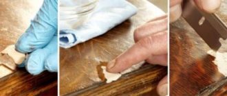
Thanks to the right materials, the apron and countertops will not only become the main decoration for the kitchen, but will also help make life easier for their owners. The fact is that most often dirt, grease stains and other contaminants appear in the work area. In order for the work surface and apron to play a protective and decorative role, it must be made of materials that are easy to clean. Typically, backsplashes and countertops are made from the following components - ceramics, metal, artificial stone or glass.
Ceramics
Countertops and kitchen aprons for the work area, made of materials such as ceramics, are considered the most popular. The sizes and shapes of tiles can vary greatly from each other. Their size can vary from 10*10 cm to 25*40 cm. In addition, octagonal and hexagonal slabs have recently become popular. The working surface, which is decorated with ceramic tiles, has high mechanical strength, beautiful appearance, practicality, ease of use, resistance to sudden temperature changes and moisture, as well as a variety of patterns and colors. The tile covering can be smooth, embossed, or with a rough surface. The main advantages include the fact that it can quickly remove grease stains from the surface using any folk remedies or household cleaning chemicals. .
Glass
Finishing the work area with tempered glass is used for modern interiors such as minimalism, loft, and hi-tech. Their surface can be matte, transparent or patterned. Please note that tempered glass looks very unusual and original with LED backlighting. The advantages of such surfaces include the fact that they are convenient and easy to maintain. This option will not absorb odors, it is easy to wash and clean using various means, it will also not cause problems during installation and you can handle the installation of the glass surface on your own, and without the help of a specialist. An additional bonus will be the pleasant cost of the material.
Stone
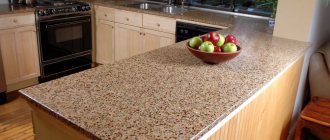
A countertop made of stone is most often made of marble, granite or even acrylic. Strength characteristics and incredibly beautiful texture help make such materials in demand among designers. Working surfaces made of stone are solid slabs or individual parts, and their thickness is 2 cm. In addition, the material is resistant to high temperatures and chemicals, has a long service life and an incredibly beautiful appearance.
Metal
Kitchen work surfaces made of metal come in the form of galvanized steel, chrome plated or stainless steel. Their surface can be matte, polished, with engraving, imprinting and any other type of decoration. The advantages include resistance to mechanical damage (since metal is quite difficult to damage or scratch), resistance to temperature changes and high performance.
Decor
The right decor will help make a cold gray kitchen cozy and homely warm. Small colored details diversify the interior: bright picture frames, colored wall clocks, decorative saucers, plates, home flowers, beautiful dishes in display cabinets.
In a small kitchen there is always a risk of going overboard with too many decorations and overloading the space. There are two rules to follow here.
- It is important that the decor is simple and at the same time effective.
- “Less is better, but better” - another golden rule that will save the interior from clutter
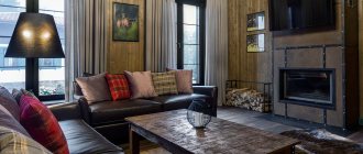
In a large kitchen and kitchen-living room in a classic style, a fireplace will be a beautiful decorative element.
Harmonious combinations
The neutrality of the gray-white palette allows you to combine these shades with any others. And the overall character and mood depend on the final composition:
- Gray and white colors are harmoniously combined with brown shades. Chocolate, honey, natural wood in any palette will make a white-gray interior warmer and more comfortable. This is a common combination in the style of contemporary, Provence, classic, etc. Modern design is increasingly being designed in such a warm and at the same time neutral palette. In this combination, minimalism usually reigns, when walls in white colors merge with furniture, facades and other structures, the interior turns out to be light and almost weightless. Parts such as the floor, countertop and apron can be brown. As a rule, there are no curtains in such an interior.
The photo shows a gray and white kitchen with a wooden countertop.
- The gray and white palette harmonizes with the black and graphite shade. Of course, the solution turns out to be quite boring and monochrome, but a few bright accents will improve the situation. This design is most often used in modern trends.
- The beige color scheme blends organically with the gray and white decor, as does the brown color. But the lighter palette has a more elegant and neutral character, which makes the white and gray interior even more restrained and sophisticated. This could be the color of curtains, upholstery of upholstered furniture in the living room, finishing of the dining area.
The photo shows the design of a white and gray kitchen and dark beige trim.
All other shades - bright and rich, pearlescent and catchy - are used in accents, decoration, and decor. Of course, they can also act as a background in spacious rooms, but then these colors will set the character.
Real photos
You can get more ideas for inspiration in the following video:
Gray Ikea kitchens
"Budbin" apartment in Stalin
"Budbin" with black tabletop
"Knoxhult" - a ready-made economy class set
Gray-green set "Bodarp"
Fronts without handles (with integrated handles) “Vokstorp”
Gray kitchens Leroy Merlin
"Dark gray set of the Megion series"
Gray-green facades “Paloma” Facades “Graphite”
Read more about Leroy Merlin kitchen furniture in a separate article - go to.
Color palette
Colored countertops look very effective. Although they are rarely found in interiors. The ideal basis for a colored top would be a kitchen with light-colored facades. A bright surface will dilute a light interior and bring brightness and cheerfulness into it. Depending on the wishes of customers, you can choose any color.
But if you have a colored kitchen, then you should choose a neutral countertop - white, beige, marble, wood or black. For rich facades in orange, yellow or red colors, tabletops in beige, cream, and brown tones are suitable.
Marble and gray work surfaces are suitable for blue, light blue, lilac, and pink facades.
When choosing a countertop for the kitchen, it is worth considering that the golden mean is white, gray and beige colors. If you love to cook and spend a lot of time creating delicious dishes, it is better to choose a more practical option, for example, a dark top with imitation stone chips. Such surfaces are much easier to maintain.