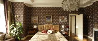
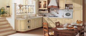
Graceful shapes, symmetry of lines, noble colors are the main features of the classic style. A kitchen in this style has a discreet aristocratic look. Neat and practical classics are great for decorating spacious rooms and small kitchens. A kitchen in a classic style has not gone out of fashion for many decades and, most likely, will never go out of style again.
Main features of a classic style kitchen
The classic interior amazes with its quality, reliability and perfection. High ceilings, large windows, a harmonious palette of colors and high-quality furniture - all this embodies an atmosphere of stability and well-being.
In the classic style, natural (or imitation) and expensive materials are used: furniture and floors made of natural wood, curtains made of natural fabrics, stone for countertops and floors, glass inserts in furniture facades, crystal chandelier.
An indispensable attribute of classics is a large amount of decor. Plaster stucco, carving, forging, ceramics, drapery on curtains - all this decorates the interior, giving it a solemn look.
Classic differs from other styles in its ideal proportions, each item has its own place, and the design looks harmonious and perfect. Modern technology is appropriately combined with classics. Only it should also have a strict form and look respectable. This is the case when metal and glass can highlight and complement wood.
Gallery
Did you like the article? Subscribe to our Yandex.Zen channel
Great article 0
How to choose an apron for a classic kitchen
An apron in a classic style can become the most striking element in it. A tiled apron, skins, mosaics - in any incarnation it will decorate the interior and protect the walls. In classic kitchens, the apron is usually matched to the tone of the furniture or in the same color scheme. For example, a white or milky apron is suitable for a beige kitchen; for those who like contrast, choose a brown one.
As for masonry, the simplest options will look good here: seam-to-seam and diagonal (diamond-shaped). The staggered laying will also fit well into the classics - when the bottom row is shifted by half of the tile. The boar tiles can be laid out vertically - this technique will help increase the height of the ceilings. With the correct selection of tile texture, herringbone masonry will give your kitchen a unique style.
Mosaic tiles will look expensive and elegant in the kitchen. It can be bright, but its tones should be repeated in the interior. The easiest option is to buy tiles with a mosaic pattern. In the classics, an apron with accents is acceptable - for example, a plain apron with drawings of fruits, vegetables and even floral motifs.
Color palette
Classic light kitchens will leave few people indifferent. If you imagined a snow-white kitchen, then this is far from the case. A light-colored kitchen includes all sorts of pastel shades. The following light shades are most often used: cream, ivory, ivory, cappuccino, beige. To design a kitchen in light colors, you can use white, delicate shades of blue and pink.
If you want to build a bright kitchen design based on contrasts, under no circumstances choose bright colors, combine light shades of different saturations.
Which curtains to choose
Sewing classic curtains for the kitchen requires natural fabrics - this is a style requirement. However, natural fabrics are highly absorbent, so stains on them are more difficult to remove than from synthetics. Therefore, you need to opt for products treated with a special dirt- and grease-repellent impregnation.
Classic style curtains should be of a simple cut. However, it is possible to have vertical folds and use lambrequins and side tie-backs. A prerequisite for design is maintaining symmetry. Of course, the simplicity of the shapes will look good on expensive fabrics that will look luxurious on their own.
As for the color palette, it should be from the natural range. Usually more neutral brown, beige, gray, and white tones are used.
Brighter options - red, blue, green - will look only in a rich and noble version. As for patterns, it is acceptable to use canvases with monograms and floral patterns.
What to remember when choosing a lunch group
Despite the fact that designers are trying to assemble sets of dining tables and chairs of different models and manufacturers, ready-made sets, which have lost their former popularity, are still relevant for classic kitchens.
Design: Anna Zhemerova
Design: Anna Zhemerova
Design: Berni Design
Design: Berni Design
However, combinations of tables and chairs from different stories are acceptable if the classics are not too strict.
Design: Kirill Istomin
Design: Kirill Istomin
Design: Pavel Burmakin
Design: Pavel Burmakin
If the house or apartment is spacious enough, it is optimal to move the dining area to a separate room, and in the kitchen provide an island with a place for snacks and coffee breaks, selecting several chairs as in the dining room, only with high bar legs.
Design: Dina Alexandrova
Design: Dina Alexandrova
Design: Fiona Baratt-Campbell
Design: Fiona Baratt-Campbell
Design: Marina Razuvaeva
Design: Marina Razuvaeva
Which wallpaper to choose
The atmosphere and general background of a classic kitchen are created by the walls. Although they are covered with a set and an apron, there are still visible areas near the dining area, under the ceiling and at the door. Given the high humidity in this room, vinyl wallpaper or fiberglass are most often used for wall decoration. Wall decoration is usually chosen to be light, monochromatic or with a dim pattern.
White walls will also look good, especially if there are a lot of details in the interior. A large number of carved elements, moldings, patterns, wall decor surrounded by white will become visually lighter.
Elegant stripes, intricate floral patterns, strict checks, monograms, medallions, imitation Venetian plaster, damask - all these types of wallpaper will fit perfectly into a classic interior. Photo panels and a la frescoes with images of paintings or ancient streets of European cities will also look good.
You can select wallpaper according to the lighting in the kitchen:
- If the windows face north, warm shades should prevail in the decoration;
- If the kitchen is sunny and bright, you can use cooler-colored wallpaper;
- If the ceilings are not particularly high, wallpaper with vertical stripes is acceptable.
Walls
The work area must be tiled. It is better to choose very high quality tiles.
The rest can be covered with wallpaper or plastic panels mounted on the walls. Full tiled walls made from materials of different shades that combine with each other look good.
In the kitchen space, it is important that the walls can be cleaned of dirt and dust. If the owners choose wallpaper, even if it is of very high quality, it is advisable to purchase a good hood.
Which chandelier to choose
A truly classic chandelier - large, multi-level, made of crystal shimmering with all the colors of the rainbow. However, such a chandelier will only fit into a large room - in a small kitchen it will take up all the free space.
For a small kitchen, you can choose lamps with glass or fabric shades, with pendants, on a brass or gold-plated frame. Such chandeliers bear the common features of the classics. However, here the classics can be diluted with some modern elements, which will not prevent the models from fitting perfectly into the interior.
Decor
Decor is the very thing that distinguishes classic interiors from any modern reworkings. Luxurious carved kitchen facades, bronze or gilded handles and hinges, semi-columns, bas-reliefs, pilasters - all this is at your complete disposal.
Mirrors and paintings in massive expensive frames, panels, mosaics, and artistic paintings look interesting. To decorate, use massive candlesticks, luxurious vases, beautiful watches - all these are also functional accessories.
Kitchen design 2 by 3 meters: beautiful ideas (80 photos)
Hood
A proven classic style in the kitchen requires a corresponding look from any equipment installed in it. Therefore, many manufacturers are developing entire series of classic hoods that complement interiors in this style.
The fireplace dome shape, golden tinting or wooden baguettes perfectly fit modern technology into a classic interior. Classic hoods are as functional as modern models: they have excellent performance, operate in recirculation and exhaust modes, and allow the installation of carbon filters to clean the atmosphere in the kitchen from odors.
So, what signs of a classic hood will enhance the stylistic direction of the interior design in the kitchen:
- A fairly large dome resembles a fireplace in a house. A dome decorated with decorative details in the design style will enhance the effect of solemnity in the kitchen;
- A dome decorated with wooden baguettes will literally transform the hood. Baguettes made from hard wood - solid oak or beech - are noble, durable wood that can withstand temperature changes and high humidity;
- In all other options, you can install a built-in hood in a classic kitchen that will not be noticeable.
What's worth hiding
It is better to remove household appliances from prying eyes. The washing machine and dishwasher are easily hidden in spacious cabinets.
If the kitchen is small, it is advisable to find a place for appliances in the bathroom or hallway. It is necessary to create harmony and comfort, and for this purpose, as few details as possible should be left in sight.
Tile in the hallway: stylish, beautiful and creative tile options (video + 170 photos)Kitchen backsplash tiles - design ideas and the best examples of using tiles (165 photos + video)
- Hanger in the hallway: 185 photos of modern ideas for the design and use of hangers
Color
White classic kitchen
White color is considered the basic color and is used to create interiors in any style. In the classical style, the design requires pomp and solemnity or the use of elaborate decor. White color will help alleviate these classic requirements. In addition, white will add light to dark kitchens and increase space in small ones.
The walls in a white kitchen can be plain or covered with wallpaper with a soft print. It is permissible to decorate the walls with stucco molding, decorative plaster, moldings, and decorative panels. A wooden floor or at least one that imitates a wooden surface (laminate, linoleum) is a mandatory style requirement. With a wooden pattern, you can also purchase porcelain tiles, which will be a more wear-resistant option.
The ceiling can be whitewashed or stretched from matte fabric, decorated with paintings, photo printing, stucco or moldings. Decoration with imitation wooden beams under the ceiling is allowed.
Companion colors will help dilute the white. The most traditional options are gilding or bronzed. If it is enough to gild only some elements - handles on drawers or make a patina on the facades, then bronze parts can be placed throughout the kitchen: buy a bronze faucet, a bronze chandelier, bronze-plated appliances.
Another good combination for a white kitchen: white and black. In black, you can purchase a tabletop, an apron, or place a table with chairs with black upholstery in the center of the kitchen. You can paint the floor and hang the curtain in brown. In general, any color can dilute a white monochrome interior. The main thing is not to overdo it.
Brown classic kitchen
In classic interiors, natural wooden surfaces are usually used, so the kitchen will look good in natural tones and in a variety of shades - from milk chocolate to black coffee. For a classic kitchen, a mandatory requirement is the presence of furniture made of high-quality natural wood. However, sets made from materials imitating natural wood are also acceptable.
Soft beige is often found in the background decoration, while furniture and parquet remain a rich brown. You can make countertops and an apron in a brown tone. Decorating facades with carvings, embossing, and paneled patterns sounds original in the decor of a brown kitchen. Matte stained glass windows, glass inserts, and gilded fittings will fit well into such interiors.
Beige
Beige kitchen is one of the varieties of brown. The color is also natural, so it looks organically in a classic style. Kitchens in beige tones have a calming effect, making the room warm and cozy. Beige has many shades: in a kitchen with north-facing windows it is better to give preference to warm ones - wheat, caramel, peach; in a warm kitchen you can make the background a cooler gray-beige.
Remember the decor. Many people associate beige with coffee, cocoa, chocolate, pastries, and sweets. Therefore, you can choose textiles and an apron with “tasty” images, and a tea still life will look good on the wall.
Wenge, dark brown, terracotta, turquoise, red, gray, lavender, golden, mint - all these colors harmonize perfectly with beige. When choosing color companions, you need to pay attention to natural combinations.
Beige is often found in nature, so nature itself can suggest combinations. For example, the color of sand looks very organic together with the colors of sea waves. Wenge is the optimal color for creating a noble and aristocratic kitchen.
Black
In black, the noble classic will look more modern. It is against a black background that the elaborate gilded elements, which have become almost the hallmark of luxury classics, look more impressive.
The predominance of black in kitchen design is acceptable only in spacious rooms. In all other cases, black is diluted with beige shades, which will look good on the floor, walls, countertops and kitchen work apron.
Gray classic kitchen
Gray walls in a classic kitchen will add discreet elegance to the room. Gray shades make up a wonderful ensemble with furniture in white, beige, and cream colors. As for, it can also be made in a classic style, although this color is more typical for modern high-tech and minimalism.
The surface of a classic gray kitchen must be matte or made using the artificial aging technique (covered with patina). Carvings, stained glass windows, glass inserts - all this will make the furniture beautiful and noble. Such furniture, which has absorbed the spirit of the times, will be supported by walls in warm shades: cream, smoky, beige.
Classic kitchen living room
Very often, in a classic style, the kitchen is combined with a dining room or living room, since in modern housing the separation of living and dining rooms is rare. Mainly, white and gold colors are used to create a lighter, freer atmosphere.
White or beige is used as a background in the style, and gold is usually used to decorate the milling on furniture facades or moldings, chair backs and dining table legs. The design of the combined room uses identical materials.
The design of such a kitchen includes more decorative elements due to its larger area. Decorative elements can easily include columns and arches, fireplaces and portals, which can also be used for zoning.
Arches and columns can be used to separate the kitchen and living room, but columns are often used exclusively for decorative purposes in the form of a relief partially extended from the walls. The portal can be used to decorate both a fireplace and a TV. In the living room, a podium can be used to separate the dining area.
Lighting and backlighting
Lighting in a classic kitchen traditionally consists of several sources. In the center of the composition is a luxurious chandelier, which is placed either clearly in the center of the room or above a large dining table. Choose multi-stage and multi-tiered designs with crystal pendants or chandeliers in the form of massive candlesticks.
For local lighting, sconces and floor lamps designed in the style of a chandelier are suitable: candlesticks, pendants, decorative textile lampshades. Modern neon or LED lighting is almost never used, but you can illuminate your work area with neat built-in spotlights.
Apartment design in Scandinavian style (80 photos)
About textiles
It is optimal to choose curtains, upholstery for a corner sofa, covers and pillows for chairs that are neutral: plain or printed with a soft ornament of the era in which the interior is stylized. A classic room initially includes a lot of decor and visual information, and background textiles will help connect all the elements into a single composition.
Design: Anna Lazareva
Design: Anna Lazareva
Design: Varvara Shabelnikova
Design: Varvara Shabelnikova
